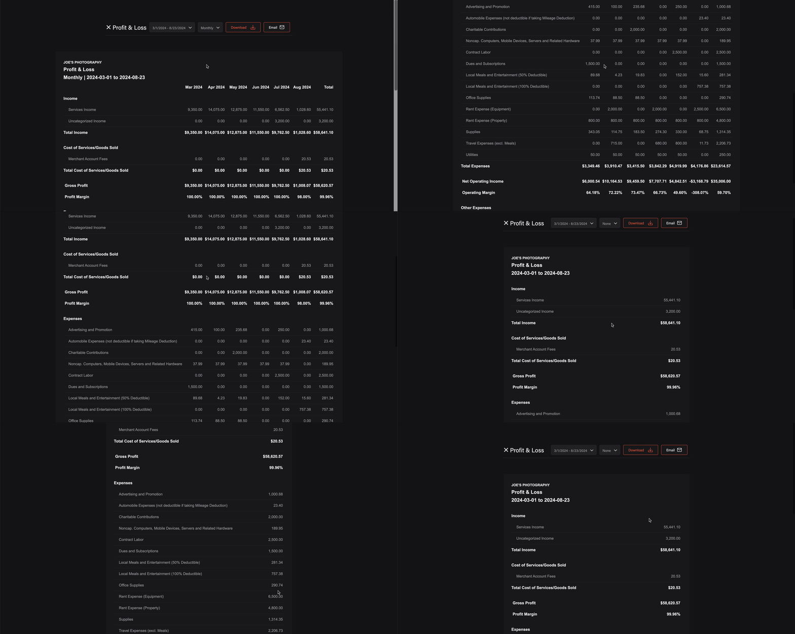
1. Initializing the Embedded Experience
To initialize the Tight Embedded experience in your project, follow the instructions on Embedding Tight’s white-labelled UI.2. Adding the Report Dashboard to your app
To render the Report Dashboard, you will need to provide theelementId parameter, which is the HTML id of the main <div> where you would like the Report Dashboard to render. When your user taps on your “Reports” navigation CTA, you simply need to invoke the following line of javascript:
3. Modifying the list of reports
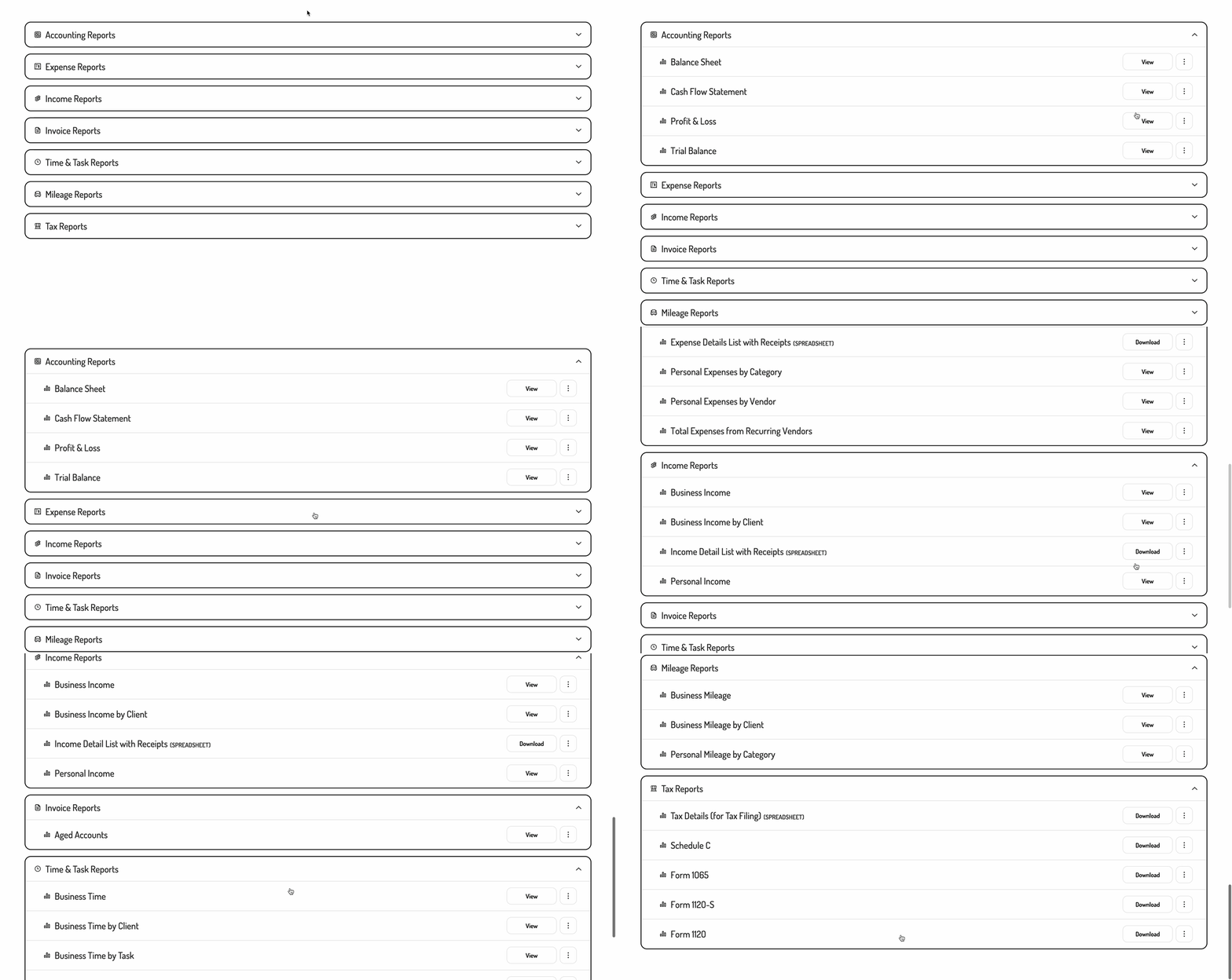
If you’d like to alter or re-order the list of reports being shown, you can do so by populating areports array within the options object as follows:
[]) will show no reports, while passing any value other than an array will cause all reports to be shown.
The reports array can contain any of the following values:
If you prefer for the list of reports to not be broken into sections, you can also set
showReportSections to false:
4. Customizing the UI to match your branding
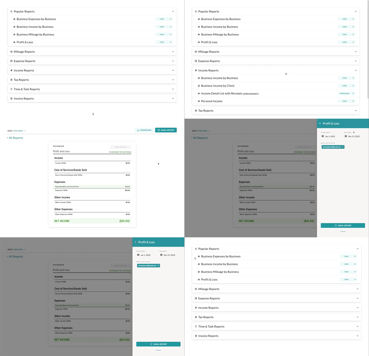
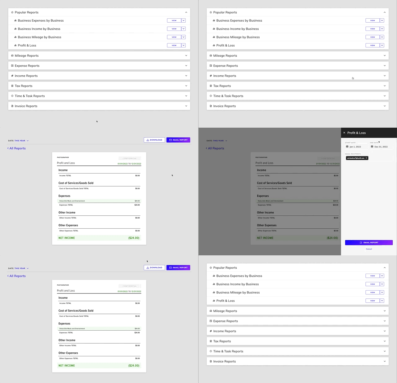
Tight’s API team can quickly customize the UI to match your branding. Please follow the instructions on Customizing the embedded UI to match your branding. Some examples of customized experiences are shown below: